Thursday, December 26, 2013
Tuesday, September 24, 2013
An Easy Halftone (Newsprint) Photo Effect
Learn how to apply a halftone, newsprint effect to a photo in just a few quick, easy steps using GIMP.
Tuesday, September 3, 2013
Create A Wooden 3D Text Effect
In this GIMP project, you are going to use a couple of wood texture images as well as a few GIMP techniques to create a fairly realistic-looking 3D text image.

Source images: Wood Texture by kovik (stock.xchng) | Wooden Plank from Image*After
Begin by opening GIMP and creating a new document with a size of 1200 x 600 pixels. Make it transparent (under Advanced Options, choose Fill with: Transparency).
Open up the Wood Texture image and resize it to a width to 1200 pixels, set X and Y resolutions each to 72 pixels/inch, Image - Scale Image… .
Copy the Wood Texture image into the original document. First select all of the Wood Texture image (Select - All) and copy it (Edit - Copy). Switch to the new image you are creating and paste the Wood Texture image, (Edit - Paste), it will appear in the Layers pallet as a Floating Selection. Make it a layer (Layer - To New Layer). Save the current image.

Now, add some text with the Text Tool. The font I used is Impact Condensed, 244 px, but most any bold font will do.

The wood is going to be used as the face of the text, Make the text layer active in the Layers pallet. Create a selection from the text (Layer - Transparency - Alpha to Selection). A “marching ants” outline of the text should appear. Invert the selection to the area outside the text (Select - Invert). Make the wood layer active and clear the selection (Edit - Clear). Hide the text layer.

Now to give the text depth. Create a new layer, Black text. Invert the selection again, be sure the colors are the default, and fill the selection with the foreground color, black (Edit - Fill with FG Color). Deselect. You should now have one text layer that has the wood texture and one that is black.

Move the black text layer under the wood text layer. The next step is to reshape the black text layer. Using the transform tool (Tools - Transform Tool - Scale), move all of the side anchor points inward to get something like this.

Then when you click the Scale button, this is what you should have.

To create the depth of the 3D effect, zoom into the text and, using the Free Select Tool, make a selection that connects each corner of the wooden text with the corresponding corner of the black text. Paint all these selections with black (on the black text layer).

Give the text a more natural edge that goes with the grooves of the wood. Make the wood text layer active, then goFilters - Map - Displace… . Set the horizontal and vertical displacements each to 2 and click OK.
Open the Wooden Plank image. You are going to do some color adjusting to this image to make it darker for the text sides. From the Colors menu, choose Curves..., adjust the curve to something like this.

The color is really bright, so change that by choosing Hue-Saturation... from the Colors menu and change the Hue to 30, Lightness to -60, and Saturation to -30. This should give you a dark brown color.

Scale the width of the Wooden Plank image to 1200 pixels. Using the copy-paste procedure you used earlier, bring the Wooden Plank image into the text image as a new layer. This wood layer goes between the wood text layer and the black text layer. To remove the excess wood texture, make the black text layer active, go Layer - Transparency - Alpha to Selection, then invert the selection. Be sure to select the Wooden Plank image layer, thenEdit - Clear. This should leave just the wood texture where the black text was.

!!! Note: You will need the GIMP Layer Effects Plugin installed to complete the next step. Get it here.
The next step is to add a bevel to the text. Make the wood text layer active and go ScriptFu - Layer Effects - Bevel and Emboss… . Set the Depth to 65, the Size to 2 pixels, and the Angle to 55. To get a little warmer edge to the bevel change the Highlight Color to #FFCC33 and the Shadow Color to #663300 rather than using the black and white default colors.

Now add an inner shadow to the wood text face layer. Go ScriptFu - Layer Effects again and this time chooseInner Shadow. Use the default settings. This will make the bevel stand out more and make the text look more like each letter is wooden.

Now you can add a shadow. You should drag the black text layer to the top of the layers stack to make it visible. With the Select by Color Tool, make a selection of the black text. Enlarge the selection by about 4 pixels (Select - Grow…).

Create a new layer, Shadow, and fill it with black (Edit - Fill with FG Color). Deselect. Go Filters - Blur - Gaussian…, Radius of 30 pixels.

Hide the black text layer (you can delete it if you like). Drag the Shadow layer under all the wood layers and over the background layer. With the Move Tool, drag the Shadow layer in the image down and slightly to the right. Reduce the Opacity to about 50%
.

You can use these techniques to create 3D text using pretty much any sort of textures you’d like with only minor modifications.
This project was adapted from a Photoshop tutorial by Tyler from DenisDesigns.
Tuesday, August 20, 2013
Vintage Letterpress Effect
In this GIMP 2.8 tutorial you will learn a quick and easy way to give your typography an ink-stamp-style effect that originated from the old letterpress printing technique.

Letterpress printing is a technique of relief printing using a printing press.Movable type is composed and locked into the bed of a press, inked, and pressed against paper to transfer the ink from the type.
This can result in some texturing, especially if some areas of the printing surface receive little or no ink. Back in the day, this would be seen as a flaw in the print, but now we try to fake this kind of texturing to simulate an aged and nostalgic appearance.
The letterpress effect is created from a texture file. The texture can be anything with plenty of fine grainy detail. Concrete, rust, or grunge textures all work well. For this exercise, I used a rusty metal texture that can be downloaded free from Image*After.

Desaturate the Texture, Colors - Desaturate…, Choose shade of gray based on Lightness. Open the Levels dialog, Colors - Levels…, and use the slider handles to increase the contrast of the image (80, 0.70, 208). Try to generate harsh white details that will represent the paper showing through the ink.

I used the Text Tool to create a layer of text, then added a mask to that layer, Layer - Mask - Add Layer Mask… .

Select all of the Texture layer, Select - All (or ⌘+A), then copy the selection, Edit-Copy (or ⌘+C). You can now hide or delete the Texture layer.
Then right-click the Layer Mask’s little thumbnail in the Layers pallet to make it the target. Paste the copied texture into the layer mask, Edit - Paste (or ⌘+V), then anchor the layer to the mask, Layer - Anchor Layer (or ⌘+H).

The texture has now been applied as a mask and is rendering black areas of the mask transparent and white areas opaque. Adding a background layer of a solid color will show the effect more clearly. If too much of the text is currently being erased, as is the case here, inverting the colors may result in a better effect, Colors - Invert.

Finally, I added an old paper texture layer to enhance the effect, File - Open As Layers… .

The final effect gives the text a popular vintage look by simulating the pressed ink appearance of those old letterpress prints.
This tutorial was derived from a Photoshop tutorial by Chris Spooner.
Thursday, June 13, 2013
Quick and Easy Pencil Sketches
In this short project you will learn how to use GIMP to quickly and easily get a pencil sketch effect.

Note that the settings used in this tutorial work for the image I used. They can vary widely to achieve desired results for different source images. If you would like to download the picture I used in this tutorial, click here.
Open the image that you want to modify. Duplicate the image layer, Layer - Duplicate Layer.

Desaturate the duplicate layer, Colors - Desaturate..., Choose shade of gray based on: Lightness in the dialog.

Now, use the Edge-Detect filter on the duplicate layer to get the basis of the sketch effect, Filters - Edge-Detect - Edge..., select the Roberts Algorithm from the drop down menu, set the Amount to 5.

Invert the colors on the duplicate layer, Colors - Invert.

Reduce the Opacity using the controls in the Layers pallet. I turned it down to 50%.

To get a black-and-white sketch quickly, the process is almost identical.

However, after you duplicate the image layer, go to the Colors menu and select Desaturate..., Choose shade of gray based on: Luminosity. Duplicate the desaturated layer and continue as above.
Filters - Edge-Detect - Edge...
Algorithm (Roberts) - Amount (5)
Colors - Invert
Reduce Opacity (75%)

This text tutorial is based on a YouTube video tutorial by Techtonicc.
Friday, March 22, 2013
Color Sensitive Text
In this GIMP tutorial you will see how to make the color of text alternate between light or dark depending on the background. I developed this procedure to meet the needs of someone who follows this blog and made a request for help. I hope others among you will find it useful, too.

Open the background image.

Duplicate the background layer, Layer- Duplicate Layer. Desaturate the background layer copy, Colors - Desaturate... by Luminosity.

Apply the threshold filter to the background layer copy, Colors - Threshold…, push the slider to the right until there's hardly any white bits in the black.
With the Brush Tool, paint out any details to match the dominant color, black or white.

With the Text Tool create your text layer in black or whatever dark color you want to use. Position it with the Move Tool. Expand the text layer to the image size, Layer - Layer to Image Size.

Make the text layer invisible by clicking the 'eye' icon in the Layers pallet.
Make the black and white layer active by clicking it in the Layers pallet. With the Select by Color Tool in Replace the current selection mode, click anywhere in the black.

Make the text layer visible and active. With the Select by Color Tool in Intersect with the current selection mode, click anywhere in the text. You should now have the portion of text that overlays the darker buildings selected. Make the black and white layer invisible.

Create a new transparent layer, Layer - New Layer..., on top of all the others and name it Light Text. Now, fill the selection on the Light Text layer with white or whatever light color you choose, Edit - Fill with BG Color. Deselect, Select - None.

Saturday, February 2, 2013
Building a Spy Movie Banner
In this GIMP project, you will learn the basics of creating a movie banner in a style that might be used for a spy movie. You will use layer blending modes, text layers, and color manipulations, as well as other skills.
Source images you can download or use your own similar images:
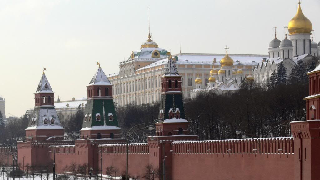
Kremlin (Original photo by Yaroslav Ushakov)
Man in Suit (Original photo by Rubén B. Todos)
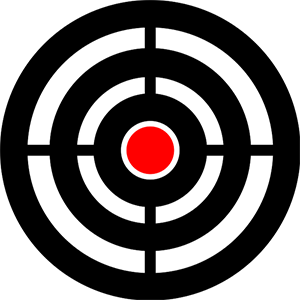
Bull’s Eye

- Part 1. The Kremlin
Apply a dark, monochromatic red, slightly blurry effect to the Kremlin image.
Open the Kremlin source image. Convert it to grayscale, Colors -Desaturate..., Choose Shade of gray based on: Luminosity.
Duplicate the layer, Layer - Duplicate Layer. Set the blending Mode of the copy layer to Multiply and slide the opacity down to 70%.
Merge these layers into one, Layer - Merge Down. Name the new layer, Kremlin.
Apply a slight Gaussian blur with a radius of 5 for both Horizontal and Vertical, Filters - Blur - Gaussian Blur... .
Now, for the dark red hue. From the Colors menu, click Colorize... . Set the Hue slider to 360, Saturation 50, Lightness -15.
You can now set this image aside for a bit.


- Part 2. The Man in the Suit
Open the Man in Suit image. With the Crop Tool, remove most of the background area. Now add transparency (an alpha channel) to the image, Layer - Transparency - Add Alpha Channel.
You need to remove the remaining white background. The Select by Color Tool will do the heavy lifting here. Click and drag in the background until all that remains is to clean up the detail around the edges of the man. Toggle on Quick Mask mode, zoom in and, with the Paintbrush Tool, clean up any remaining bits of the background, especially in the hair and inside the man's right elbow. Grow the selection by 1 px, Select - Grow. Then clear the contents of the selection, Edit - Clear. Save the image and close.
You can now reopen the Kremlin background image. Open the Man in Suit image you just worked on as a new layer, File - Open as Layers... . Be sure that in the Layers pallet it is above the Kremlin layer and name it Man.Use the Move Tool to position the Man layer to the left side of the picture and down just a bit.


- Part 3. The Text
Add the movie title and some other bits of text to the banner. Select the Text Tool. For the title choose an appropriate font and size. I used HeadlineA, 240 pt, Color white. Click in the picture and type the desired text. Position the text in a good place.
Create a selection around the text with the Select by Color Tool. Click anywhere on the white text and it will all be selected. Create a new transparent layer on top of all the others, Stroke. Reset the color swatches to the default. Apply a 4 pixel black stroke to the selection on the Stroke layer Edit - Stroke Selection... . Merge the Stroke layer down onto the text layer.
Similarly add additional text elements to the picture.


- Part 4. The Bull’s Eye
Open the Bull's Eye image as a new layer under the Spy Movie text layer. Set the blending Mode to Lighten Only. Reduce the Opacity to about 85%. Position the bull's eye where you like with the Move Tool.
You've now brought all the components together. Use this lesson as a starting point for your creative expression. Modify and experiment to your heart's delight!
